Helping Vehicle Owners Get Back on the Road

Role: Lead Product Designer

Team: Product, Engineering, Data, Customer Success

Timeline: 1 Year

Tools: Figma, Adobe After Effects, Usertesting.com, Procreate

Impact: +11% flow completion, adopted across CCC's consumer mobile portfolio, became template for future carrier rollouts

Exploring the Existing User Journey

The Problem
CCC's First Look mobile app helps vehicle owners submit accident photos and info to get a repair estimate — a stressful moment for users navigating an unfamiliar insurance process. Customer account managers were reporting that the existing linear flow was too long and unclear, and users were dropping off before completing it.

My Approach
I started with research, not screens: mapping the existing user journey and jobs-to-be-done to understand exactly where and why users were getting stuck, and translating those findings into storyboards and flow diagrams stakeholders could react to.

The core insight: users weren't failing because of bad UI, they were failing because the process forced them through one long, undifferentiated sequence with no sense of progress or control.
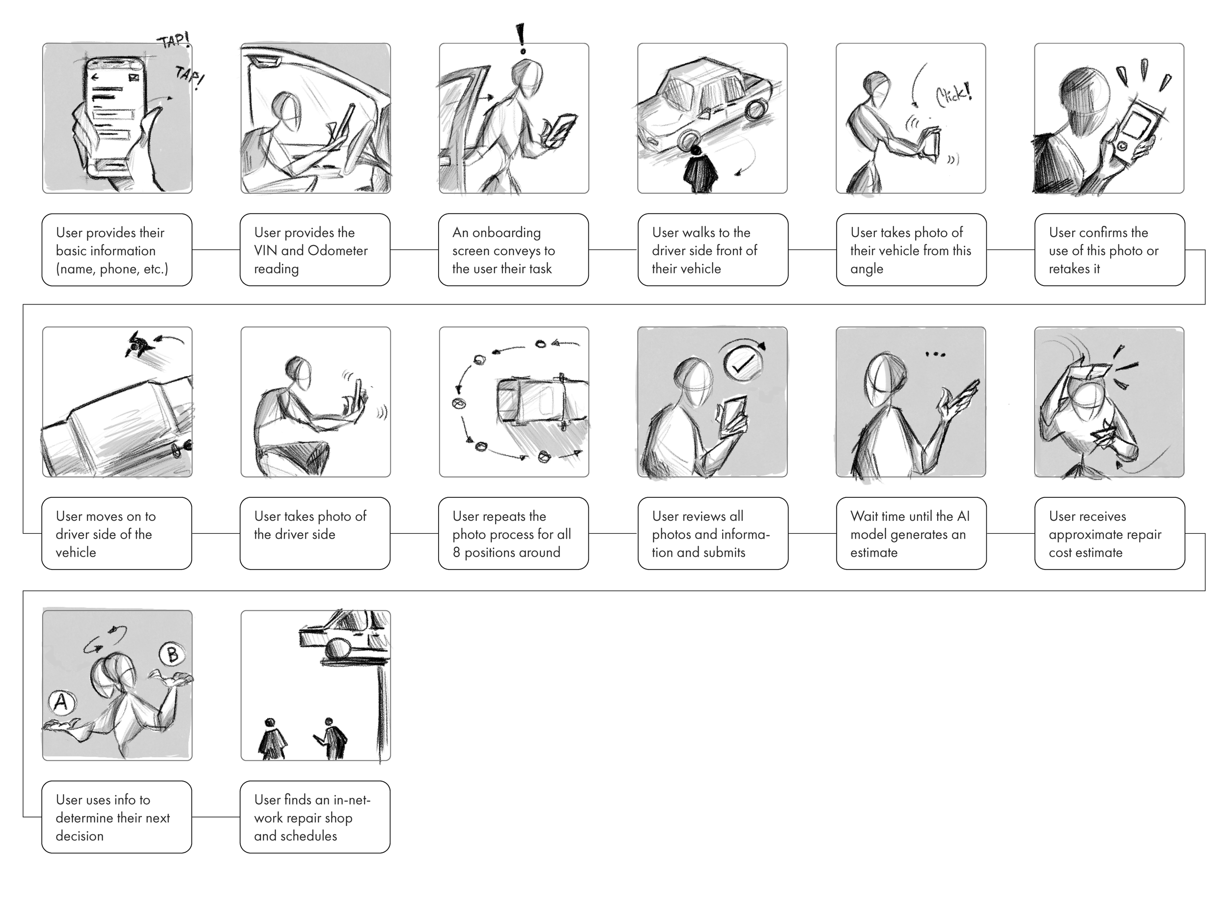
A storyboard or comic strip illustrating a process involving a user interacting with a mobile app, a vehicle, and an onboard system for vehicle maintenance or repair. The panels include sketches of people using their phones, walking, taking photos, and reviewing repair estimates.
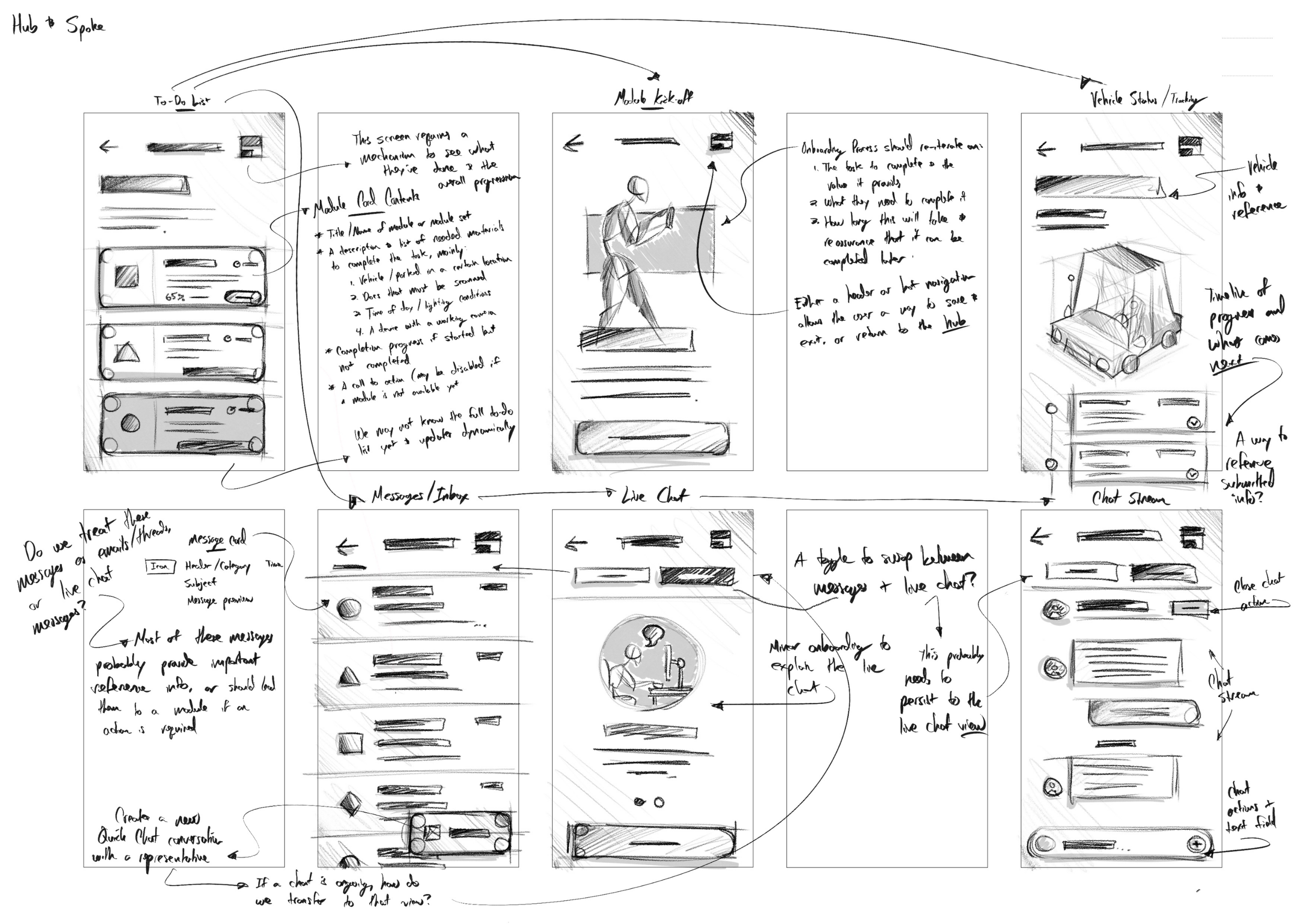
This image is a sketch of a mobile app's user interface, showing various screens and features. It includes wireframes for a to-do list, message inbox, live chat, vehicle status, and chat screen, with handwritten notes and annotations explaining functionality and design ideas.
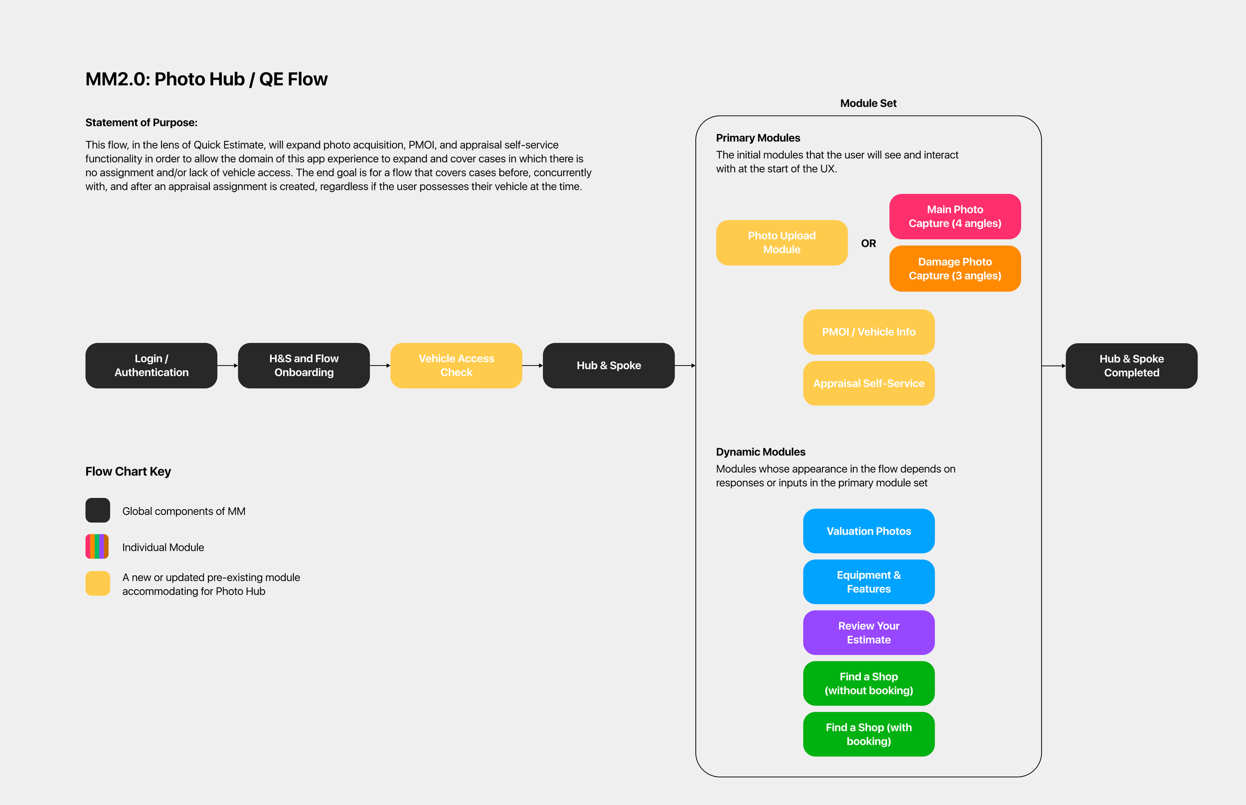
Flowchart diagram illustrating the MM2.0: Photo Hub / QE Flow process, with modules such as login, vehicle access check, and hub completion, along with a module set on the right showing options for photo capture, PMOI info, self-service, valuation photos, equipment, review, and shop finder.

I made the call to move away from a single linear flow toward a hub-and-spoke model — breaking the process into distinct, named tasks users could complete in any order, at their own pace. This was a bigger structural change than a typical redesign, and I brought engineering and product in early to validate feasibility before committing design time to high-fidelity screens.

Changing UX Paradigms to a Hub & Spoke Model
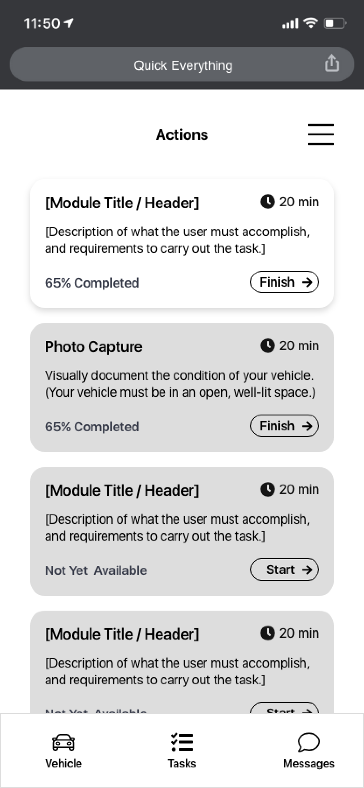
Mobile app screen showing tasks for vehicle documentation, including module titles, description, and progress indicators, with options to start or finish tasks.
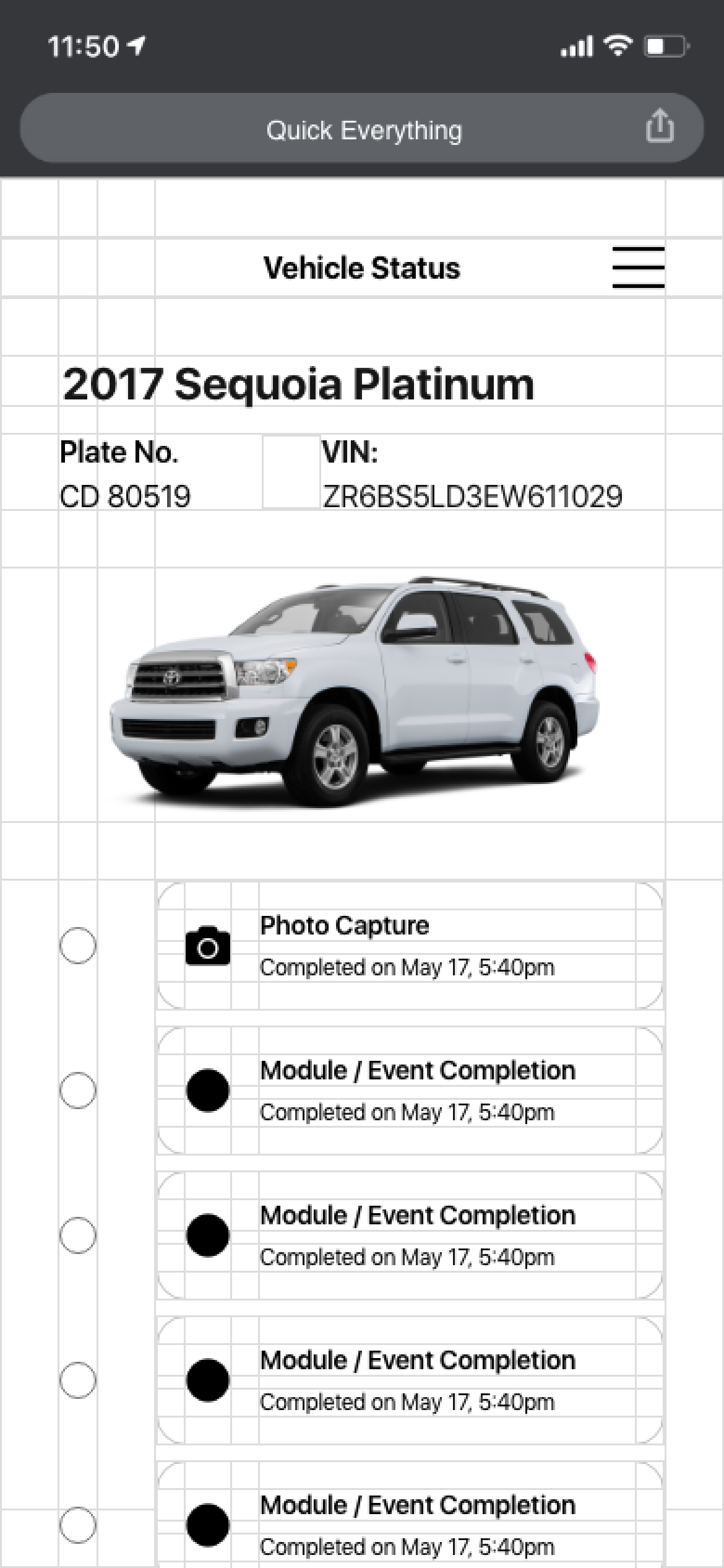
Screenshot of a vehicle management app displaying details for a 2017 Sequoia Platinum, including the license plate number, VIN, a photo of the vehicle, and timestamps for photo and event completions.
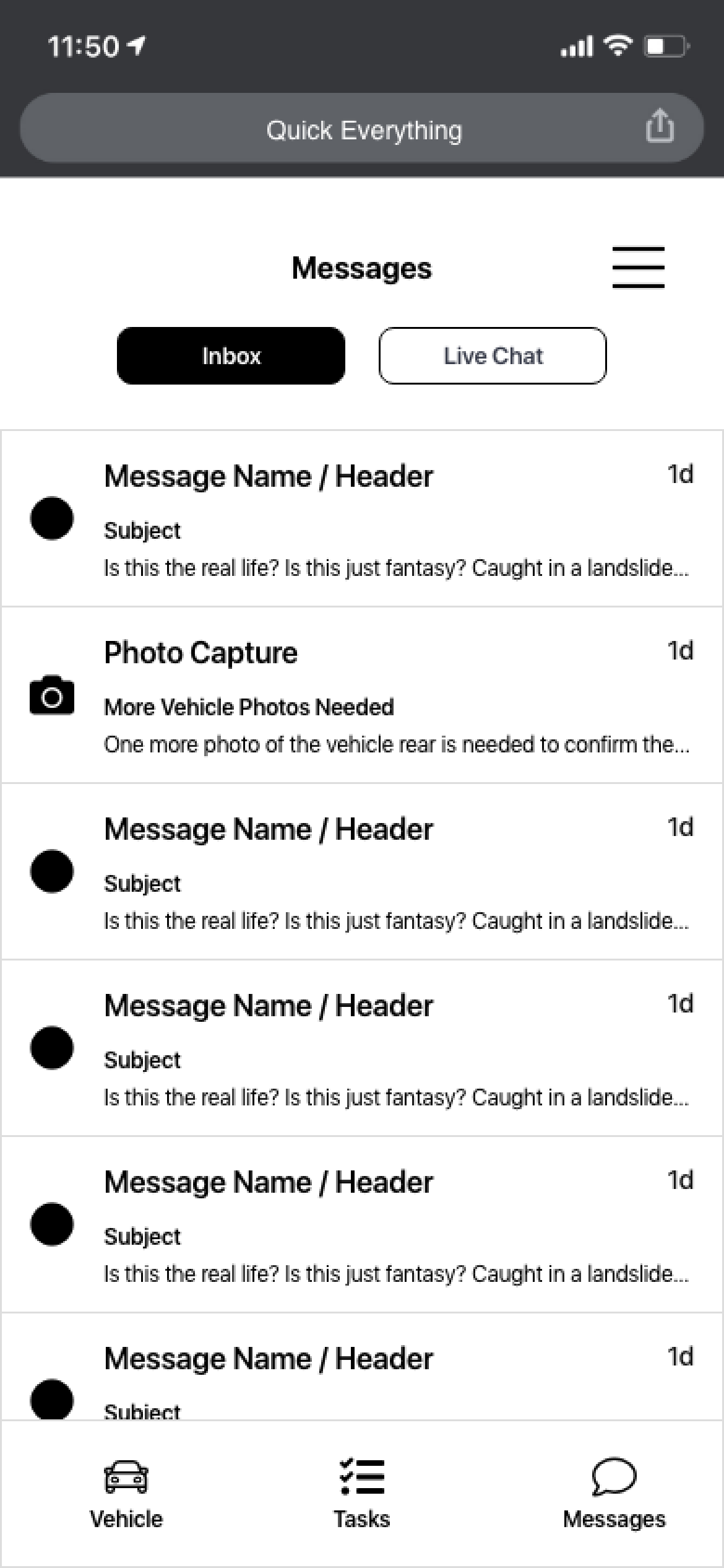
Mobile phone screen displaying a messaging app with tabs for Inbox and Live Chat, showing multiple message previews, and navigation icons for Vehicle, Tasks, and Messages at the bottom.

Updating the Visual Language

Building for Scale
Alongside the redesign, I built a net-new design system: componentized UI, screen templates, typography and grid rules so the new patterns could scale across CCC's broader mobile portfolio, not just this one app. I also redrew the illustration library to support easier carrier-specific customization for both design and engineering teams.


Illustration of a small store or retail shop with a blue and white color scheme, a door, and a yellow and blue sign hanging outside.
A stylized map with dotted lines, heart symbol, and location markers, indicating navigation or a route.
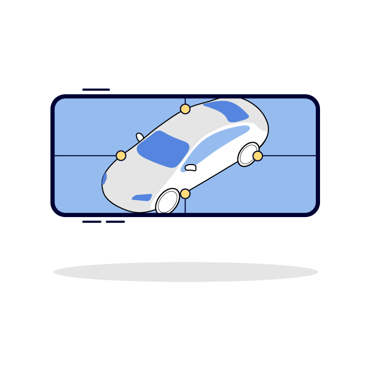
A four-panel illustration of a white sports car with a blue outline, shown from different angles, with a yellow background in each panel.
Illustration of a blue file folder with a thumbtack and a yellow note sticking out.
Illustration of a person getting hit by a car door that is opening. The person is falling backward with a surprised expression.
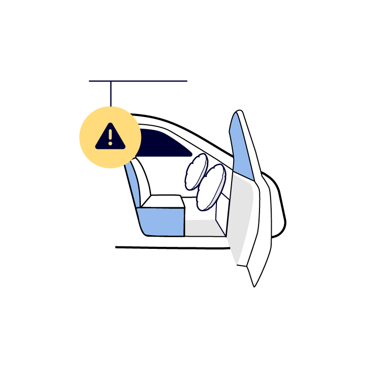
Diagram of a car interior showing an airbag warning alert.
Illustration of a person pointing at a car on a giant charging station.
Illustration of a film camera with a person working on it and another sitting on a chair inside the camera, with film reels on top.
A yellow paper airplane flying over a blue smartphone with white lines indicating motion.
Illustration of two sheets of paper, one yellow and one blue, with a blue rectangular background.
Illustration of a smartphone displaying a 3D car model with labeled points around it.

Usability Testing

I along with members of our UX/Research team ran moderated usability testing, both remote (UserTesting.com) and in-person — including watching real users photograph their own cars to stress-test the new capture flow. Findings were synthesized, communicated, and turned into actionable design changes before final handoff.

  • Task completion increased 11%

  • Contributed to an 8% increase in take rate across insurance partners

  • Rollout was staggered (smaller carriers first), and the new design became CCC's template for future consumer mobile products

Final Designs & Artifacts
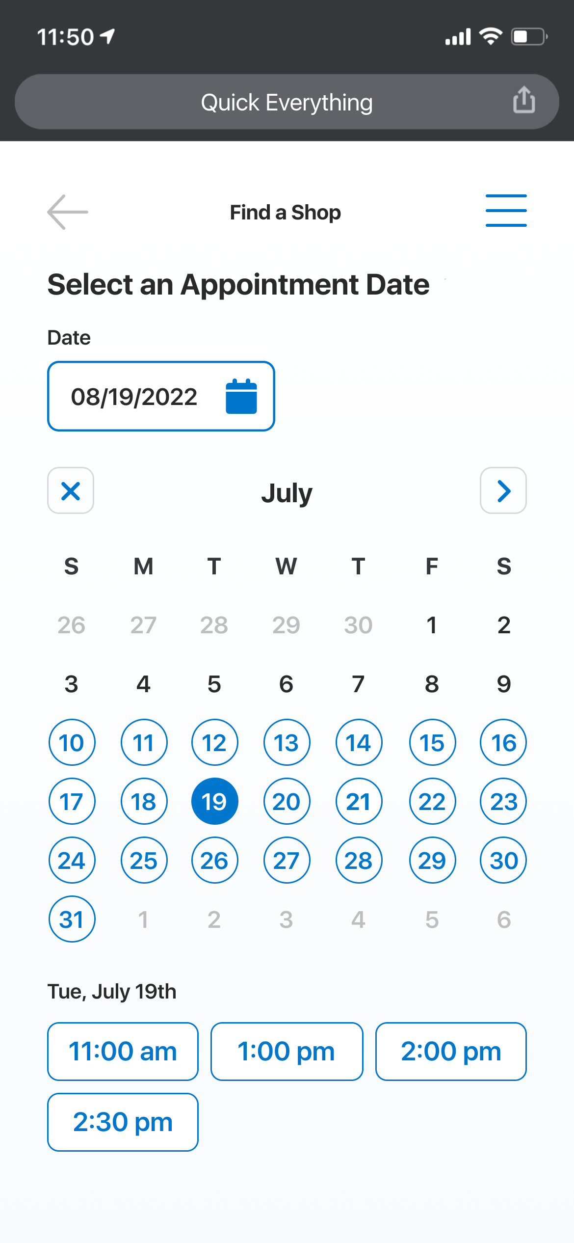
Mobile phone screen displaying a scheduling app with the date set to July 19, 2022, and available appointment times listed as 11:00 am, 1:00 pm, 2:00 pm, 2:30 pm for selecting a specific time.
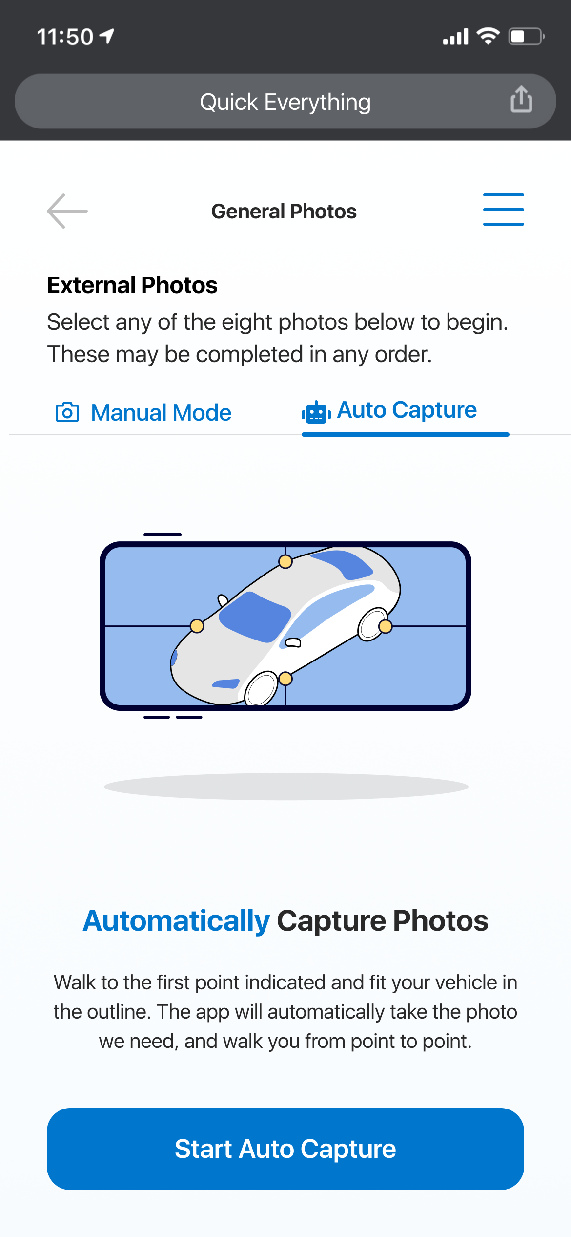
Smartphone screen showing a car auto capture feature with an illustration of a car inside a grid, with options for manual or auto photo capture.
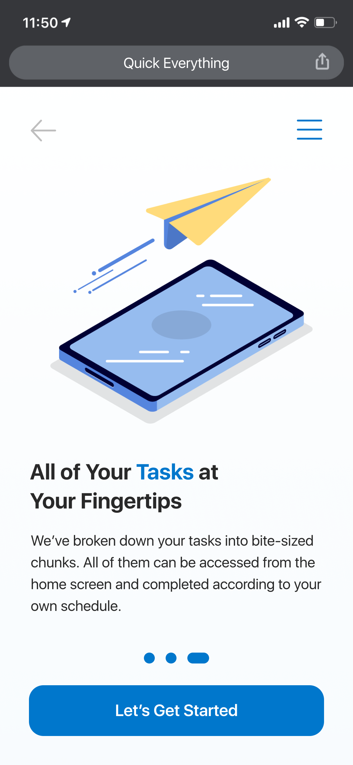
Screenshot of a mobile app introducing task management features with an illustration of a smartphone and a paper airplane, and a blue button labeled "Let's Get Started."

The new mobile app’s rollout strategy was a careful, staggered one; smaller insurance carriers received the new app first, with immediate positive response.

Over time, larger carriers adopted the new design and now CCC’s consumer mobile portfolio stands as a strong revenue generator for their business in the Auto-Physical Damage space.
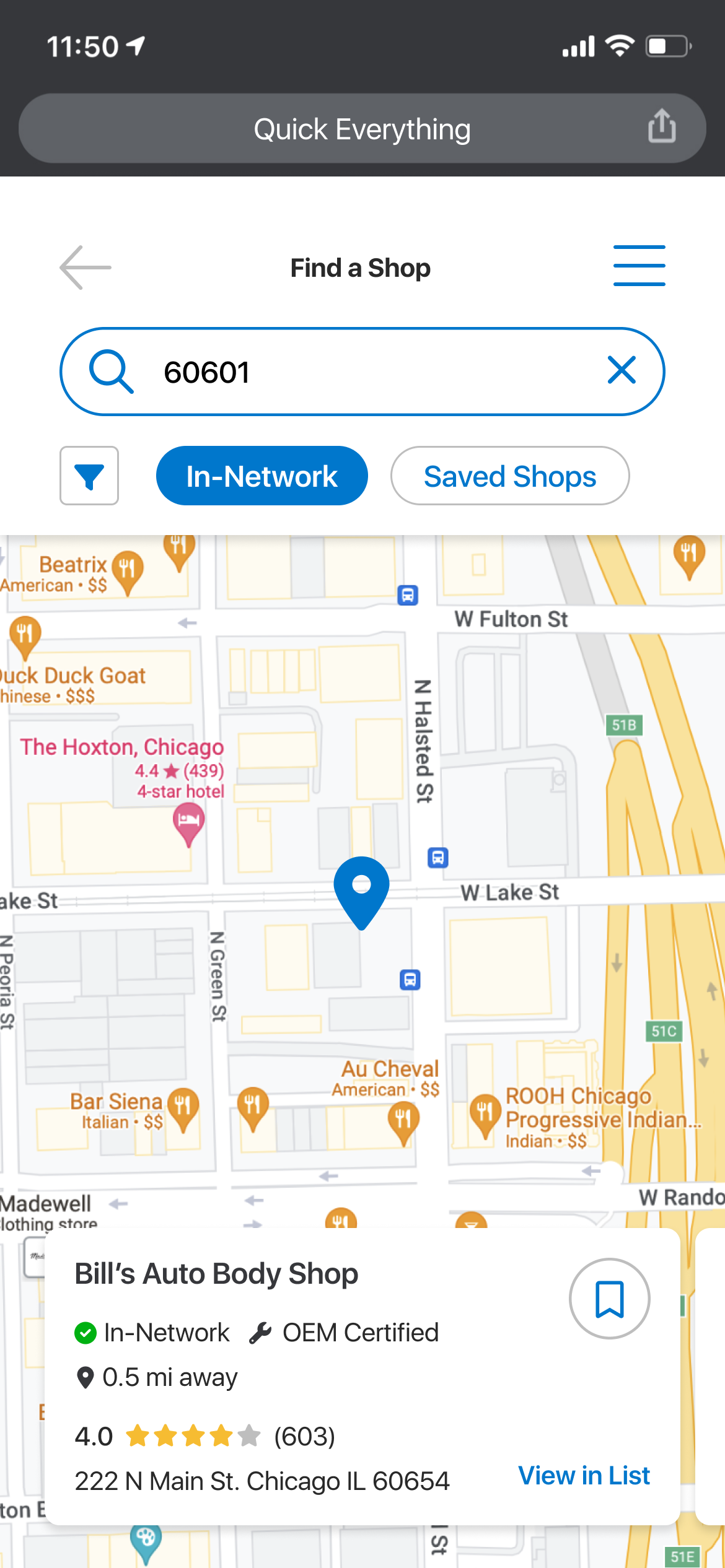
Map showing the location of Bill's Auto Body Shop at 222 N Main St, Chicago, near W Lake St and N Green St, with nearby restaurants and landmarks.
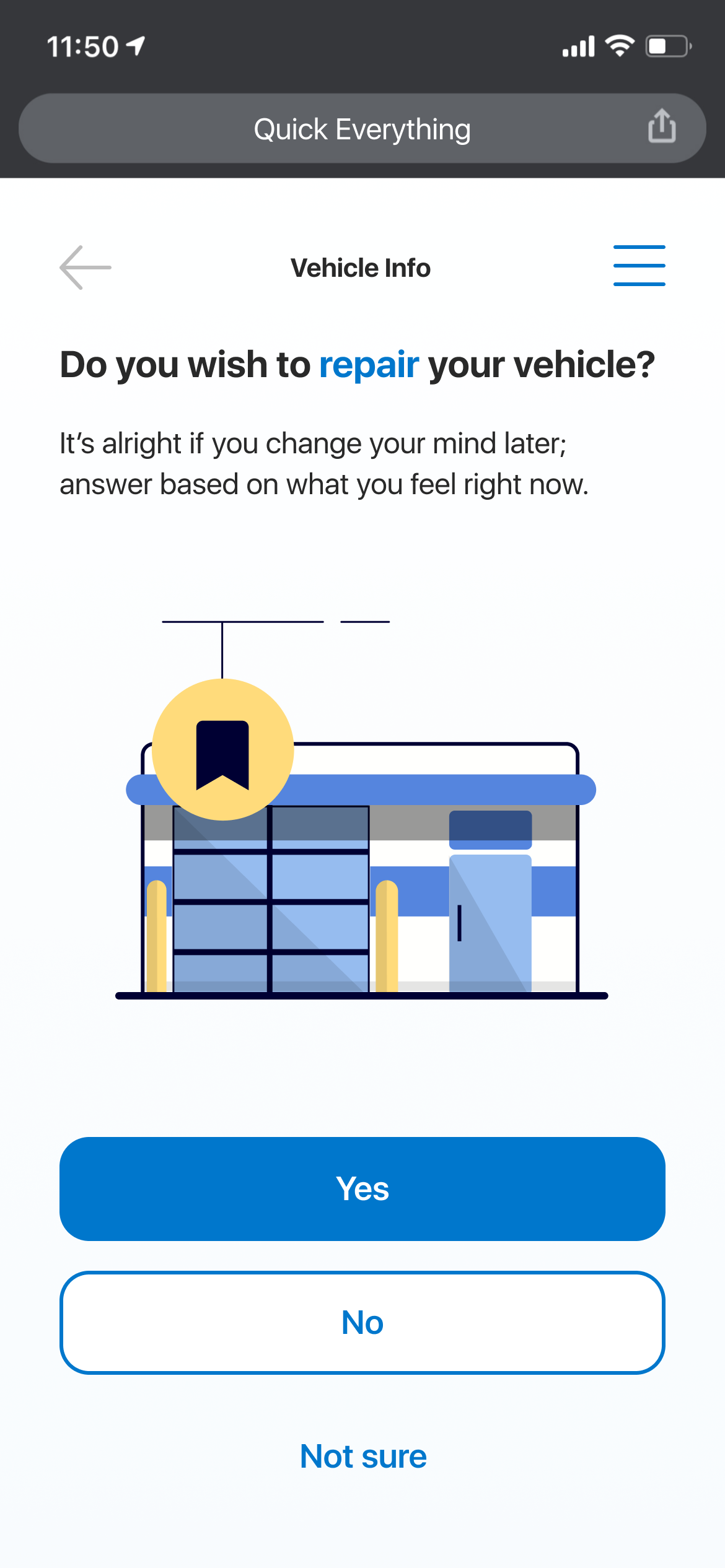
Mobile phone screen displaying a vehicle service app asking if the user wants to repair their vehicle, with options to select Yes, No, or Not sure.

Redesigned form and onboarding screens follow modernized design practices and conventions which tested to be more effective than previous iterations.
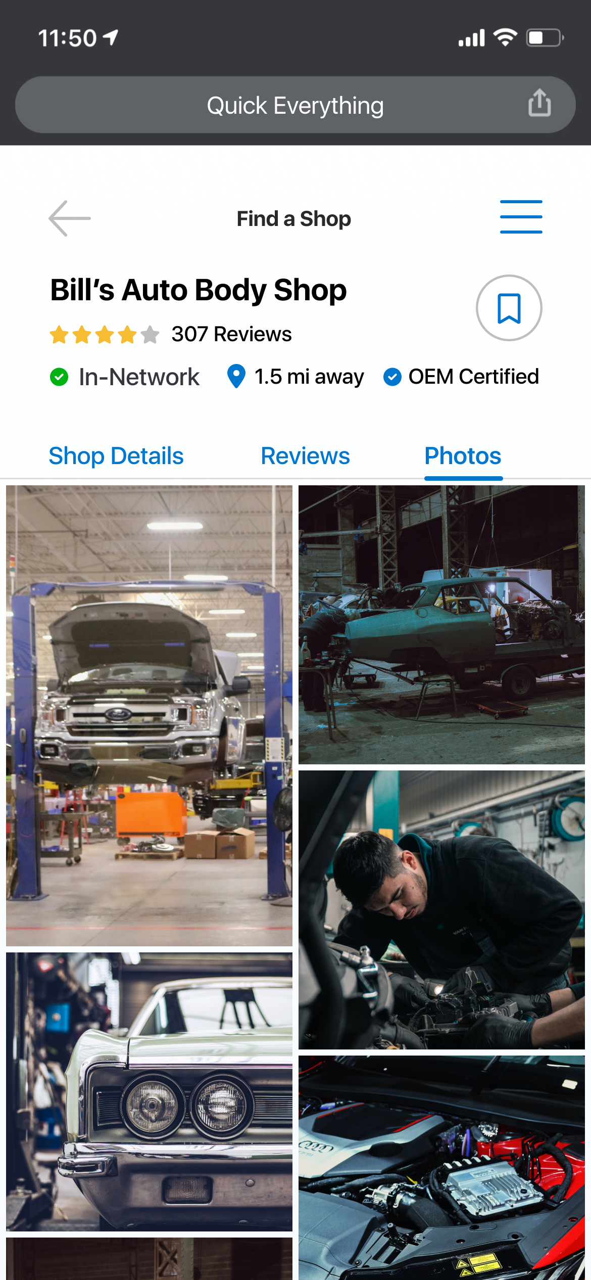
Photos showing a car repair shop, cars being repaired and a mechanic working on an engine.
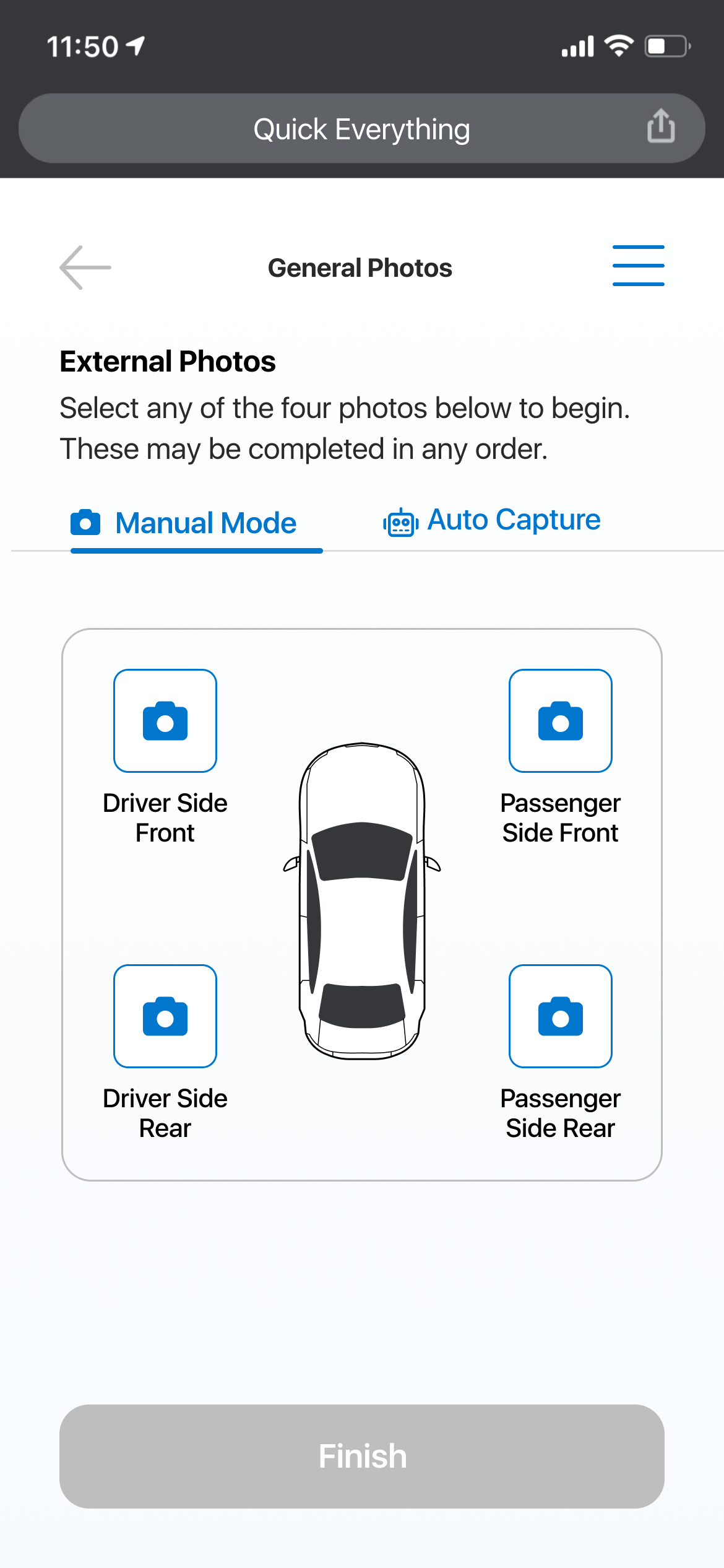
Mobile app screen showing a car's external photo setup with four camera options: driver side front, passenger side front, driver side rear, and passenger side rear, with a top-down view of a car in the center.
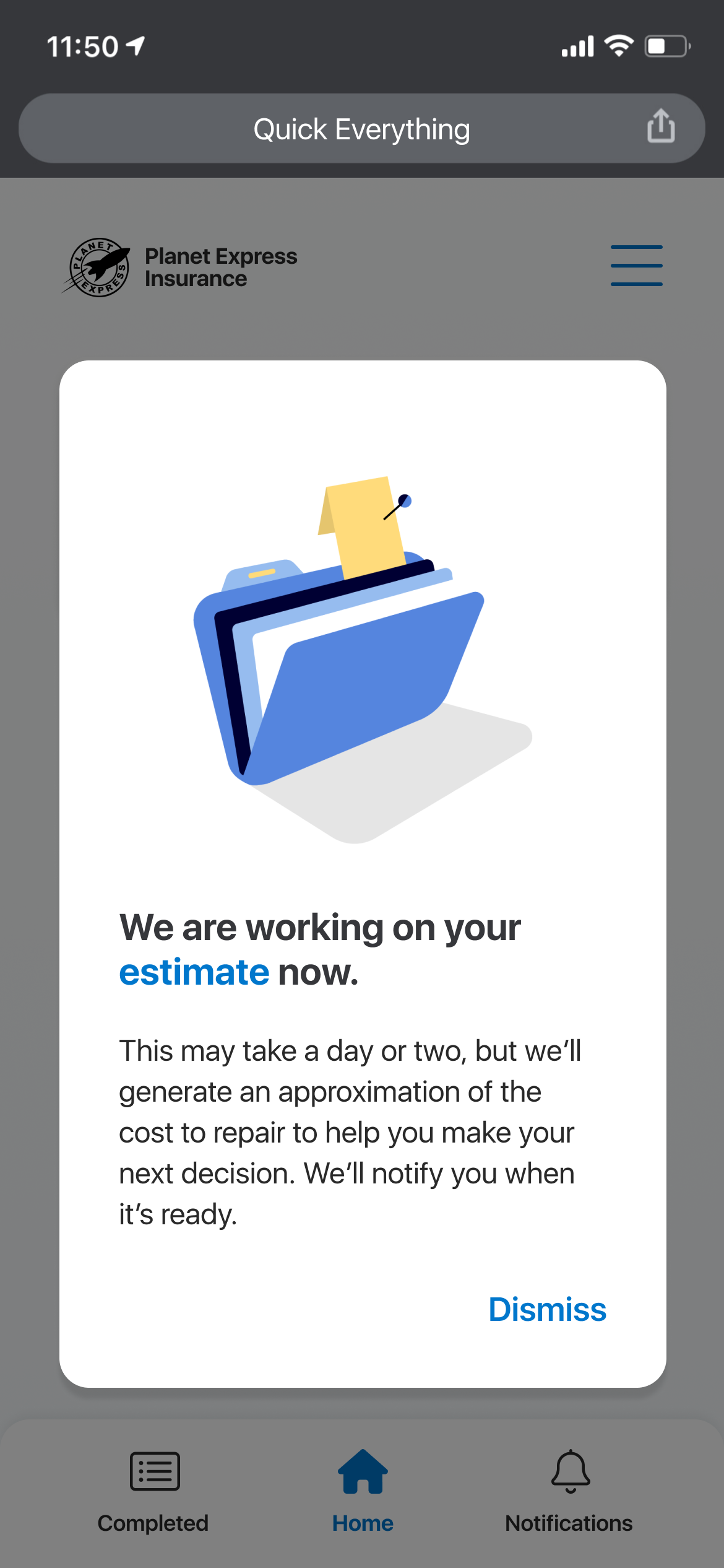
A smartphone screen showing a message about working on an estimate for repair costs, with a graphic of a blue file folder and a yellow sticky note.
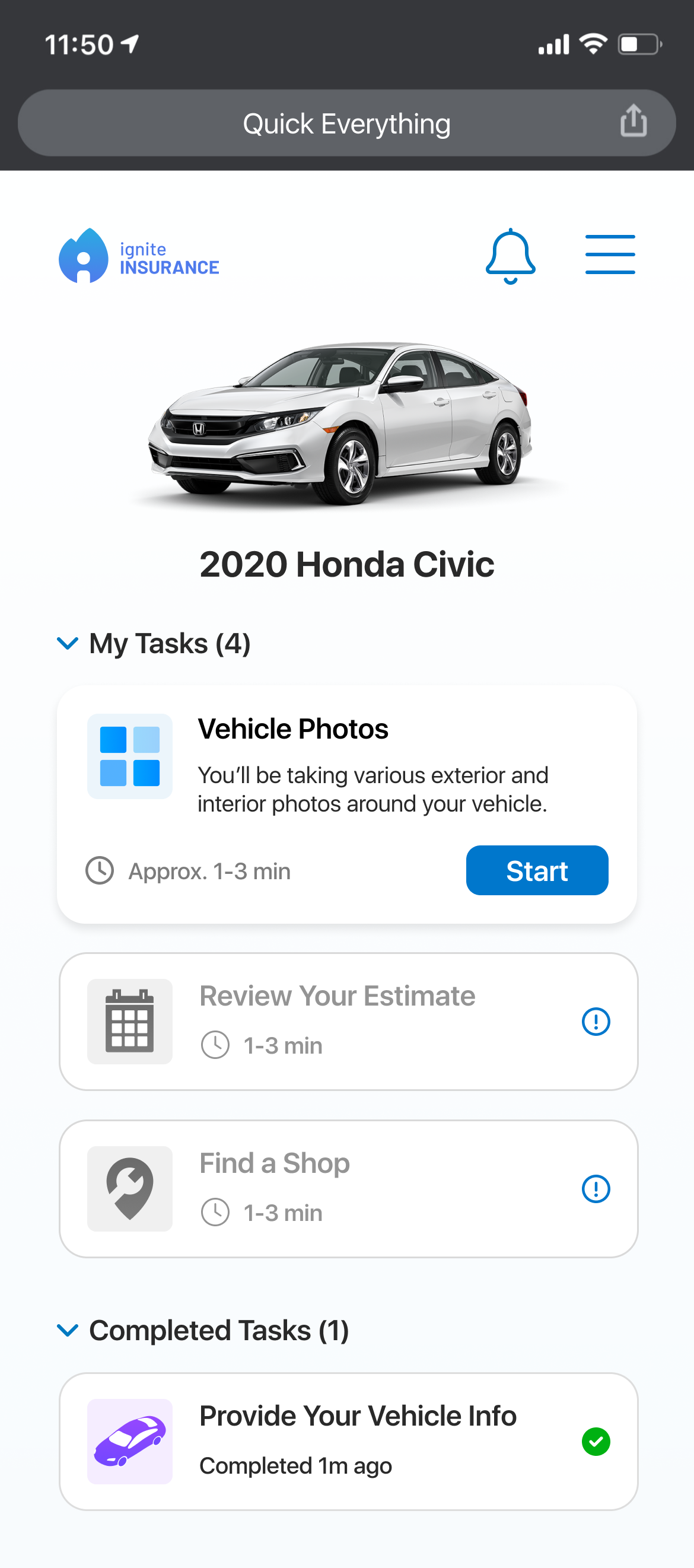
Mobile app screen showing options for managing a 2020 Honda Civic, including tasks such as taking vehicle photos, reviewing estimates, and finding a shop, with a photo of the car at the top.

Real-time, AI-powered photo capture is another feature I designed for the consumer experience, where the user can slowly scan their vehicle while the app automatically captures the photos needed for estimate generation.
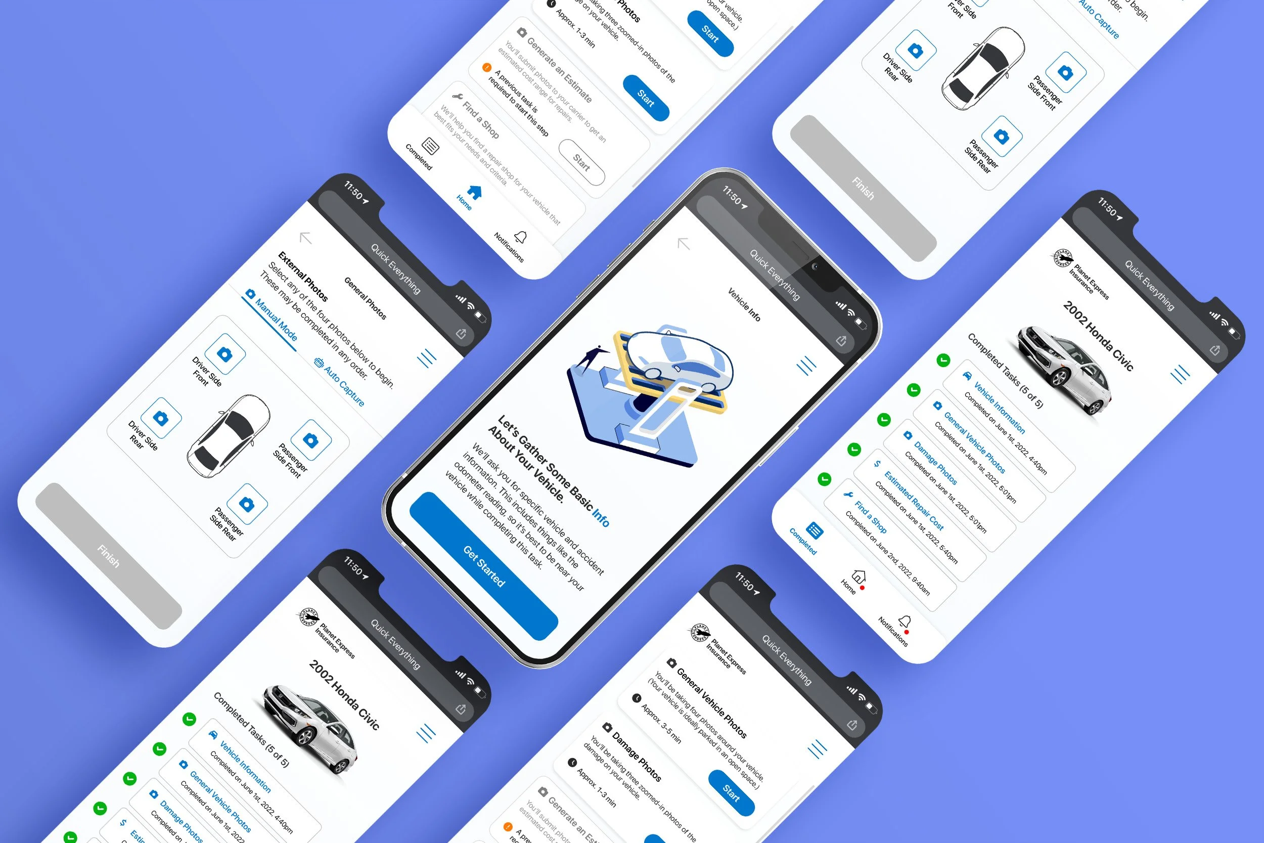
Multiple overlapping screens display a mobile app interface for vehicle documentation and insurance. Screens show options to take photos of car sides and upload information about a Honda Civic, with a blue background.

Consumer mobile is one of my largest and most successful undertakings as a designer - I conducted research, created a design system, and created new UIUX flows as the lead designer and saw tangible, positive results for the business.